Sequence viewing > Aesthetics Index - Resource - ©
Lloyd Godman
Colour theory in photography
When we study colour we can get confussed, we need to define what system of color we are looking at!
Aesthetics and Design
In design and aesthetics where we are looking at the relationships of colours within an image - a photograph, print, painting.
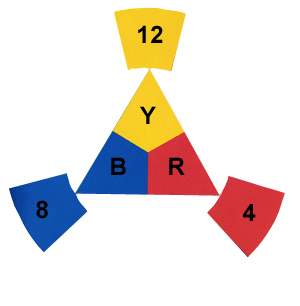
The key Colours are
These are called the primary colours and we can design and or analyze an image on where there colours are placed within the frame and the ratio of the frame they occupy. |
|
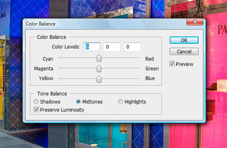
Photoshop
However, in photoshop we are concerned with the control of colour within the image and for this to work here we use a different colour system.
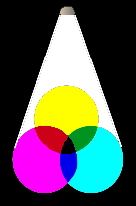
the primary colours are:
we see these on the right hand side of the control bar in the image
while the secondary colours are:
- Cyan (this is placed opposite red because there is NO red in cyan)
- Yellow (this is placed opposite blue because there is NO yellow in blue)
- Magenta (this is placed opposite Green because there is NO green in magenta)
|
|
Colour enlarging - mixing light
Then in analogue negative colour enlarging of a photograph through an enlarger we have white light which we control with a set of filters- so we are looking at mixing light and we use:
Cyan, Yellow Magenta, which takes away from the white light |
 |
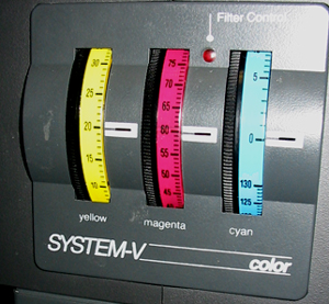
Colour filter controls of a colour enlarger |
|
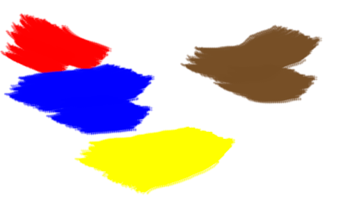
Painting
However, in graphic arts like painting we have a different system again - when we mix the three primary colours red - blue - yellow we have a dark brown |
 |
Want to learn more? - do a workshop or one on one with Lloyd Godman |