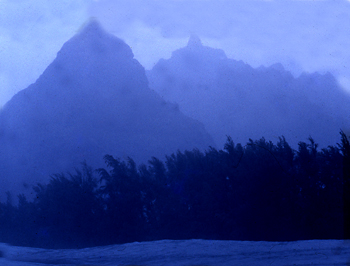
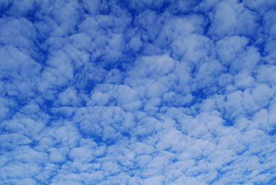
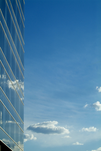
Sequence viewing > Aesthetics Index - Resource - © Lloyd Godman

the colours - Blue

Blue recedes visually, it is much quieter and less active than red. Of the three primary colours it is the darkest colour, and it has its greats impact when deep. It has a transparency that contrasts with reds opacity. This is why it works well as a colour for misty and hazy landscape subjects.


Although blue tends towards neither green nor violet, it has a considerable latitude, and is a hue that can be difficult to to discriminate. Identifying a pure exact blue is more difficult than identifying Red or Yellow.


Expressively Blue is used to reference coolness.


Want to learn more? - do a workshop or one on one with Lloyd Godman

Comment on this resource